You are viewing your 1 free article this month. Login to read more articles.
Pearson rebrand to reflect 100% focus on education
Pearson has rebranded to reflect its 100% focus on education.
The rebrand launched on Monday (4th January) with Pearson intending to roll out its redesign globally over the next two years.
Designed to work flexibly within a wide range of international markets and cultures, age ranges and audiences, and, importantly, "to work on all different applications", the rebranding is hoped to be "used and built on" as well as "played with" to "deliver better learning experiences" worldwide, as according to a Pearson-commissioned video telling its "design story".
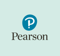
The new Pearson logo, developed by advocacy company Freemavens, takes its form from an exclamation mark fused with a question mark to create a "thumbprint" 'P' character punctuated by a dot underneath. While the combination of question mark and exclamation mark is called an interrobang, Pearson has thus managed to fuse not two but three characters into a single ‘unit’ for its logo. The company said in the video that the new logo represents a "combination of excitement, curiosity and individuality".
A Pearson spokesperson said: “Pearson is 100% focussed on global education and helping learners to progress around the world. Having a strong brand is fundamental to building our reputation and our success as an education business. Investing in the brand is about investing in the future of the company.”
The lead creative partner in the rebrand, responsible for all the colours, the fonts, the illustration, the photography, house-style rules and guides that make up the full new visual identity, was Together Design. According to it, the rebrand is "a nod to all of Pearson's fantastic heritage and history but to be ready for the future", reflecting Pearson's transition from traditional book publisher to a digitally-minded, services-led learning business.
"This rebrand will literally take it from being a footnote at the bottom of the page to bring it upfront and proud and much more recognisable," said Together Design founder Heidi Lightfoot. "Pearson's old branding was more appropriate for a book publisher - which of course has amazing heritage - and while it's still doing books, what it was finding difficult to convey was accessibility and digital applications. Also, as a company, it is often better known by its brands and the products that come under Pearson, rather than by the Pearson name.
"The Pearson team had conducted quite a bit of research. They had a very practical criteria for change. They realised perception was quite low on who Pearson was and what it did. I think they found people were saying things about Pearson but it didn't have a brand strong enough to tell its own story. So the idea is to create a strong masterbrand that can unify its very broad and diverse product portfolio, products and services, and distinguish the company from its competition."
Pearson's tone of voice has also been under scrutiny, taking on-board copywriters' advice at Serious Oomph, because, Lightfoot added, "Pearson had so much to say about the things it was doing to improve literacy and its social mission and efficacy and products; but didn't really have all the bits of messaging at its fingertips in order to tell those stories".
All branding guidelines and materials, of which there are already at least 80 "assets", including one 150-page guideline, will now be available for Pearson employees to access at its new brand hub launched this week.
Pearson first pledged its "100%" focus to global education when it sold the FT to Nikkei in July for £844m, followed by the sale of The Economist in August for £469m. The company is also expected to sell its 47% stake in trade publisher Penguin Random House in the near future, with Pearson c.e.o John Fallon telling a media conference in November that it would not sell until "at least 2017".
