You are viewing your 1 free article this month. Login to read more articles.
Taking poetry off the page
Publishers could get much more creative in how they present their authors’ words.
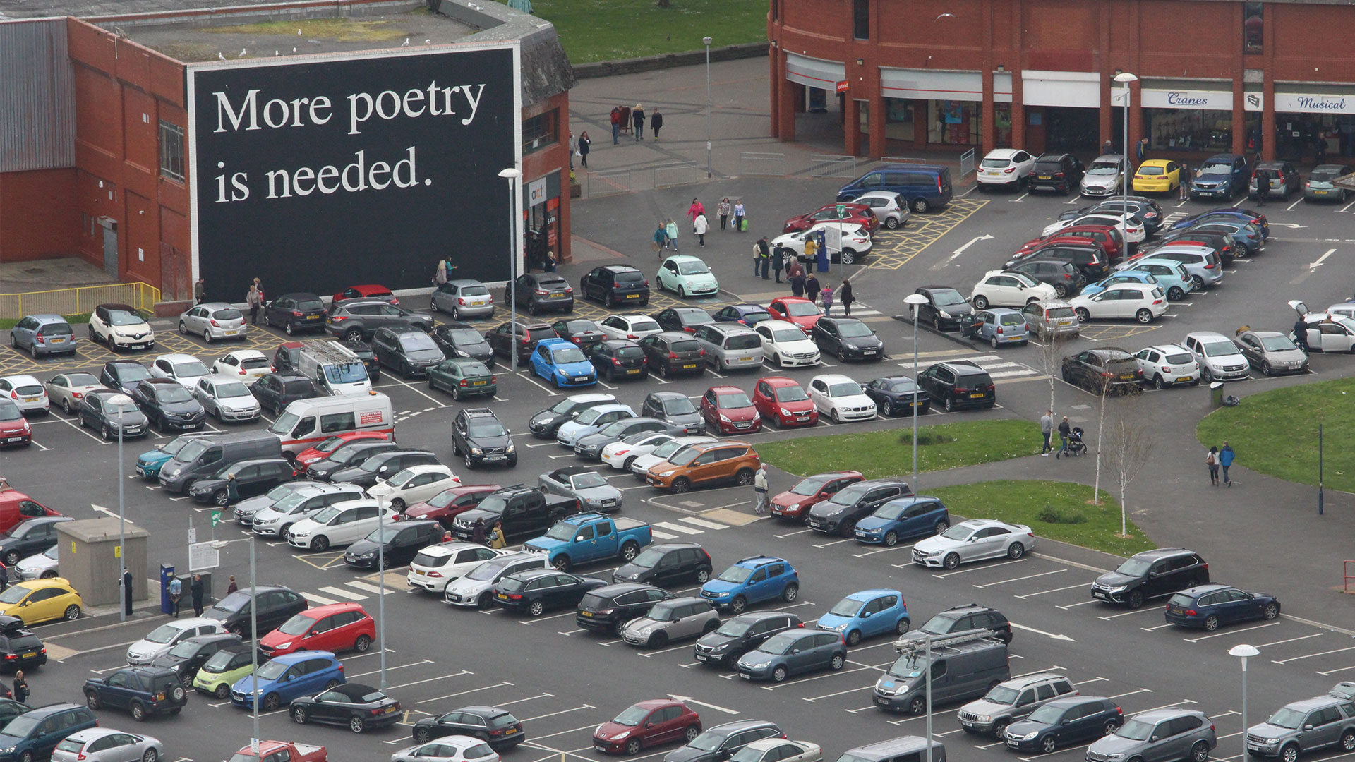
Are you a lover of visual poetry and just don’t know it yet? From childhood encounters with Lewis Carroll’s "The Mouse’s Tale" through to the influence of the concrete poetry movement on design (would the Yves Saint-Laurent logo have been invented without the inventions of the Brazilian concrete poets of the 1950s? – I doubt it), visual poetry is in the air all around us. More than that, it’s also increasingly incorporated into architecture and printed on buildings, and with a new exhibition called "Poetry & Architecture" just opened at Hay Castle, there’s no better time for publishers to embrace this genre-shattering form.
I have a theory that visual poetry’s natural home is anywhere but its own habitat; like lichen, the form thrives on a symbiotic relationship with other forms. It doesn’t have its own section in bookshops but you’ll trace its spoor through the poetry, art, design and fiction shelves. It’s too fluid to settle in one place. When I co-edited The New Concrete: Visual Poetry in the 21st Century (Hayward Publishing, 2015) the aim was to create a source book for the genre that artists, poets and publishers could take the seeds from and re-wild in other places. The New Concrete includes poems projected onto churches, printed onto buildings, even created from computer viruses. We live in a radical age for text, being the first generation to touch words on a screen, lift them, and place them somewhere else. We are pioneers of these new possibilities and visual poetry is at the fore of this seismic change, adding lustre to other forms of writing and illuminating physical spaces; turning walkers into readers and readers into viewers.
Shaped text gets readers talking, photographing and sharing. It feels like a discovery. It feels contemporary. You only need to search #visualpoetry on Instagram for the evidence
Visual poetry’s placement between reading and viewing is so important because it’s embedded into who we are as humans. The American poet Dick Higgins, originator of the term "intermedia", argues that the story of visual poetry "is, in fact, not the story of a single development or of one simple form, but the story of an ongoing human wish to combine the visual and literary impulses, to tie together the experience of these two areas into an aesthetic whole". Although our entire education system has long been entrenched in making the visual and textual separate, as humans we don’t want to interact with the world in such a straightforward binary way: we want to see and read simultaneously. It is for this reason that children discovering visual poetry in workshops at the National Poetry Library get so excited by it. They instinctively get it. Visual poetry is the only form of poetry that gets young people making their own work in a matter of minutes; it removes any fear of the empty page. So why aren’t publishers maxing out on the appetite and pushing their authors to create visual poetry in their work? Shaped text gets readers talking, photographing and sharing. It feels like a discovery. It feels contemporary. You only need to search #visualpoetry on Instagram for the evidence.
Publishers of fiction should be particularly engaged with these possibilities. Think of the blank and black pages in Laurence Sterne’s Tristram Shandy. The "Mouse’s Tale" in Alice in Wonderland. The modernists were full of it: from James Joyce’s wind-tossed typographical typos in the "Aeolus" section of Ulysses to the experimental novels of Christine Brooke-Rose. B S Johnson’s books contain all kinds of shaped texts, as do Max Porter’s. As well as the many brilliant things happening in the work of all these writers, their popularity is in no small way down to the instinctive love readers have for visual poetry. Encountering the form is a visceral experience; it is a joyous, playful medium that explodes the insular world of the reader. Visual poems provide the moment that makes you nudge a friend or partner, sharing the page that you know they’ll immediately connect with.
The Hay Castle show, curated by Fabio Barry and Pelé Cox, demonstrates the power of visual poetry in action, transforming the medieval castle inside and out. The show examines a range of encounters between text and structure: from concrete poetry, to poems inscribed on buildings, to architects who are inspired by verse. The outside of the castle contains a strip of neon text, Robert Montgomery’s "LOVE DETONATES THE DISTANCE BETWEEN US TO ASH HOLDS YOUR FLOODED HEART IN THE FIRE OF NIGHT". Montgomery has a further piece inside the castle which reads "ALL PALACES ARE TEMPORARY PALACES", reminding us – as great poetry does – that our stakes in permanence cry out for big art. Publishers wanting to creatively rethink their workspaces can take so much from this. Why not commission one of your authors to write create a piece for the space you work in? Take a window and fill it with words. Put poems behind toilet doors. Set words inside an object and place it in the centre of the meeting table. Prompt your authors to think visually. Allow the nimble, fluid world of visual poetry into the world you work and think in. Then share it because that’s exactly what readers will want to do themselves.
Architecture & Poetry is on at Hay Castle until 3rd September.

