You are viewing your 1 free article this month. Login to read more articles.
ABCD 2020: Alex Kirby on designing Culture in Nazi Germany
The seventh annual Academy of British Cover Design awards, known as the ABCDs, is this year being announced virtually, in lieu of hosting a physical event. Two winners are announced each day this week (commencing 19th October) by the organisation’s Twitter account and Instagram feed.
The seventh annual Academy of British Cover Design awards, known as the ABCDs, is this year being announced virtually, in lieu of hosting a physical event. Two winners are announced each day this week (commencing 19th October) by the organisation’s Twitter account and Instagram feed.
The awards recognise excellence in UK-based cover designers; the criteria for this year’s awards was any book published between 1st January and 31st December 2019 (e-books are admissible). In order to promote inclusion and a breadth of entries, entry is free for designers, who may submit their own work or that of a fellow designer.
Awards will be given in ten categories this week—Children’s 0-5, Children’s 6-12, Young Adult, SciFi/Fantasy, Mass Market, Literary Fiction, Crime/Thriller, Non-fiction, Series Design and Classic/Reissue—with the initial entries whittled down to a shortlist by a number of book- and design-industry insiders.
The winner of this year's Non-Fiction award has been revealed as Alex Kirby. The Bookseller caught up with Alex to find out how he came up with the winning design...

First off Alex, can you tell us a little about yourself, and how you landed in the world of book design?
I am senior designer at Yale University Press (part-time), plus I run my own freelance cover design business. My first job in publishing was at Random House as a junior designer way back in 2002, and I was there a little over three years. I then joined Faber & Faber, and after 12 years there I headed to Yale in July 2018, launching my freelance business at the same time.
Moving onto your winning cover, can you tell us a little about the brief you received?
Happily, the brief itself was very open. It referenced competitors' book jackets and some possible design routes but, crucially, allowed me the freedom to explore and experiment. As part of my own subsequent research, I looked at many similar titles including How Democracy Ends, The Confidence Trap (David Runciman), To Hell and Back and Roller Coaster (Ian Kershaw) and The Pursuit of Power by Richard J Evans.
Due to a looming catalogue deadline, there wasn't sufficient time to read and digest the entire manuscript, but thankfully the brief neatly summed up the book. What I took from it were how integral artists and the arts were to the smooth running of the Third Reich, and how art and culture was used to instil Nazi ideology in ordinary people and manipulate public perception of the state and its enemies. My challenge was to effectively distil all these engaging themes into a memorable cover.
How did you go about creating the cover?
I stuck to my tried and trusted process, which is pretty much:
- Read and make notes on the synopsis/book
- Talk to the editor
- Research the subject
- Brainstorm
- SKETCH. SKETCH. SKETCH
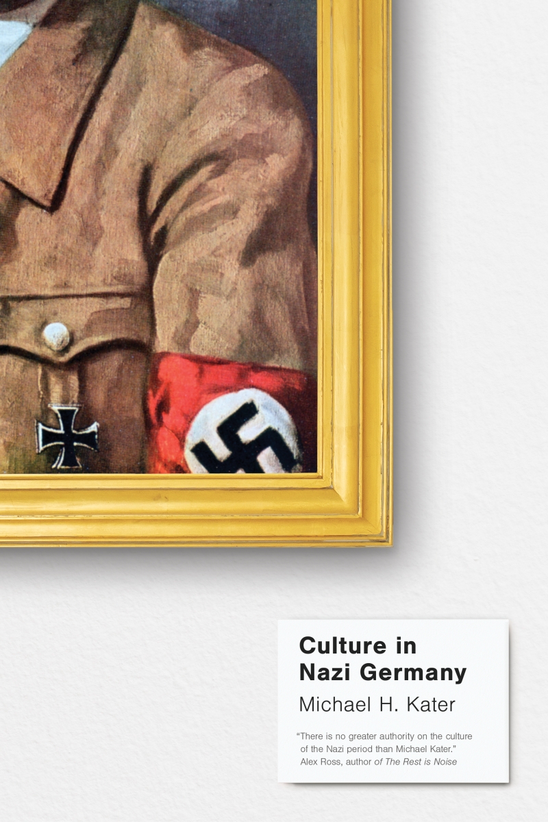
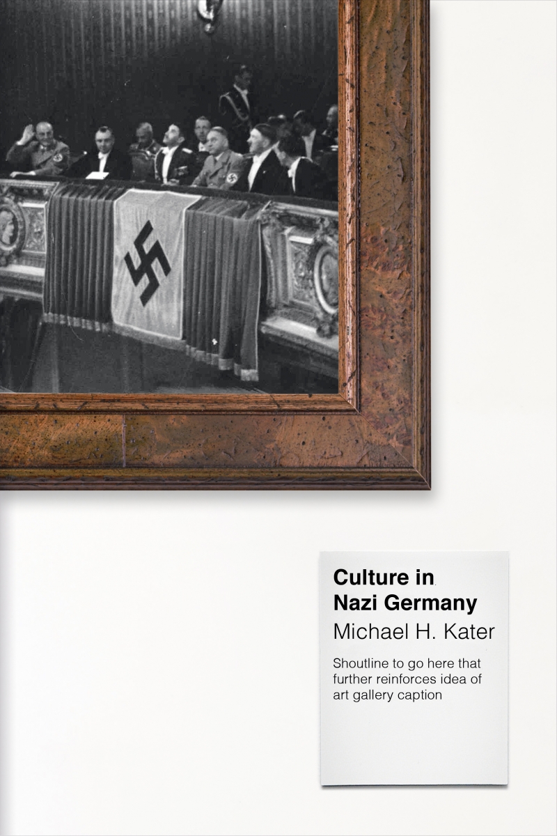
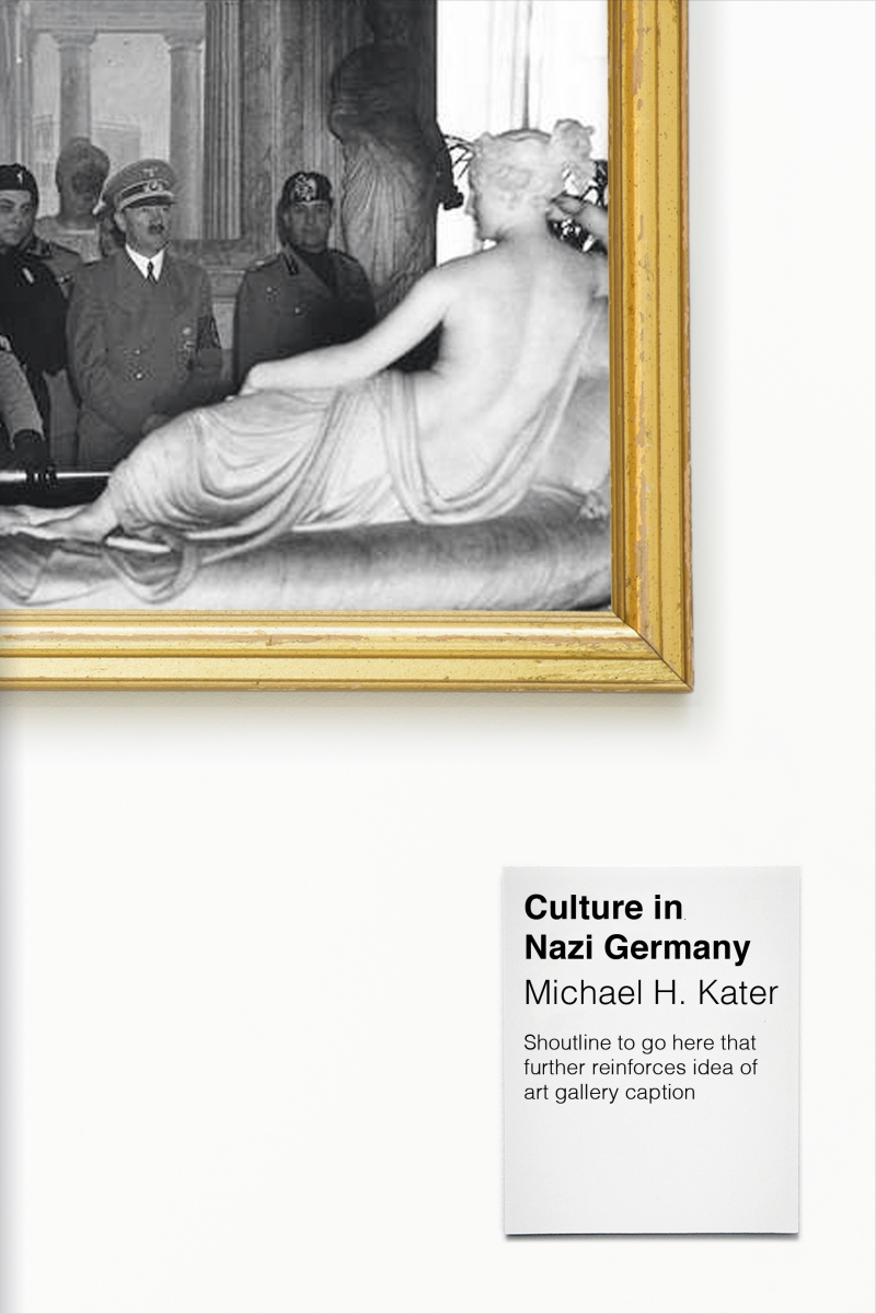
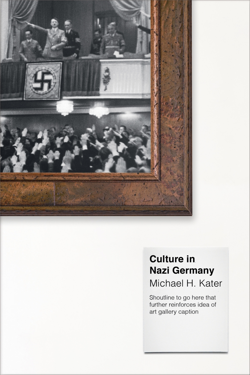
Throughout all these steps, I knew I wanted to create something clever and fresh for the genre, yet also tasteful given the sensitivity of the subject. Perhaps bravely (or foolishly, as I'd only been at Yale for a month!) the "picture frame" concept was the only one I presented to the Cover Team. Fortunately, they loved it. My initial roughs used various photos within the frame, before I discovered B von Jacobs' portrait of Hitler, which was ideal.
Following discussions with Rachael Lonsdale (Yale's head of editorial management), we agreed that Hitler's face should never be fully displayed anywhere on the jacket. This decision partly reflected the themes of censorship covered in the book, and partly was down to being mindful of depicting such a notorious figure on a cover. After this, I tried out various picture frames. It had to be bold enough to attract attention (and lead your eye to the title), but not showy or vulgar.
Can you share any alternatives or ‘killed covers’ for the project?
Certainly. As I mentioned previously, earlier iterations of the cover used authentic Nazi-era photos within the frame, before we settled on the painting of Hitler.


What has been your favourite project to work on in the past year?
There have been many, but I would choose Anger by Barbara H Rosenwein.
It was a hugely stimulating and rewarding process overall—from initial brainstorming through to the commission of a bespoke rubber stamp for the title lettering. There was something almost childlike about experimenting with different papers and colours, resulting in an inky desk and hands! It was creatively liberating to execute an idea without the typical constraints of a Mac.

Which book would you most like to design a cover for?
It would have to be someone like Len Deighton; his backlist covers are iconic, so it would be a great honour—and challenge—to redesign them.
If you could change one thing about your job, what would it be?
When publishers reveal covers online, for the creatives responsible to be properly credited.
To see more of Alex's work, visit his online portfolio.
