You are viewing your 1 free article this month. Login to read more articles.
ABCD 2020: Jack Smyth on designing Bluebeard and Doxology
Tom Tivnan talks to Jack Smyth - who has won 2 awards at the latest ABCDs
The seventh annual Academy of British Cover Design awards, known as the ABCDs, is this year being announced virtually, in lieu of hosting a physical event. Two winners are announced each day this week (commencing 19th October) by the organisation’s Twitter account and Instagram feed.
The awards recognise excellence in UK-based cover designers; the criteria for this year’s awards was any book published between 1st January and 31st December 2019 (e-books are admissible). In order to promote inclusion and a breadth of entries, entry is free for designers, who may submit their own work or that of a fellow designer.
Awards will be given in ten categories this week—Children’s 0-5, Children’s 6-12, Young Adult, SciFi/Fantasy, Mass Market, Literary Fiction, Crime/Thriller, Non-fiction, Series Design and Classic/Reissue—with the initial entries whittled down to a shortlist by a number of book- and design-industry insiders.
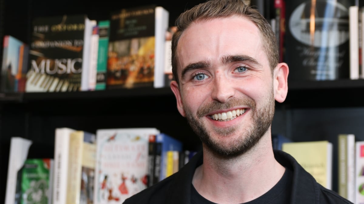
Two awards were revealed today: Classic/Reissue and Literary Fiction. Both awards were won by Jack Smyth. The Bookseller caught up with Jack to find out how he came up with the winning designs...
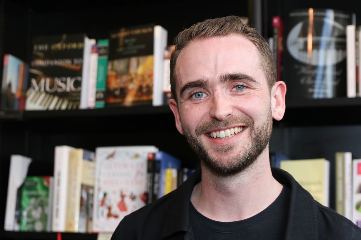
First off, can you tell us a little about yourself, and how you landed in the world of book design?
I was brought into the murky world of book cover design when I managed to land an internship in the art department of Little, Brown while I was finishing off my MA in Graphic Design. I turned on the charm as much as I could, until they offered me a junior role there once the internship finished. I stayed there for a great two years. From there, I went to Simon & Schuster for a year, and then on to the art department of 4th Estate/William Collins. After a few years there I decided to go freelance, which I’ve been doing for the last year. I currently work on my own from a small studio in Peckham.
Moving onto the cover, can you tell us a little about the brief you received?
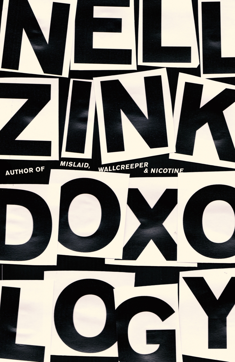
Doxology is Nell Zink’s cross-generation state-of-the-nation novel which covers the early post-punk New York City scene, 1980s bass pop, the political upheaval of the (second) Bush era, all told through the voices of a found family. I think the brief was very open: to read the book and do something that felt big.
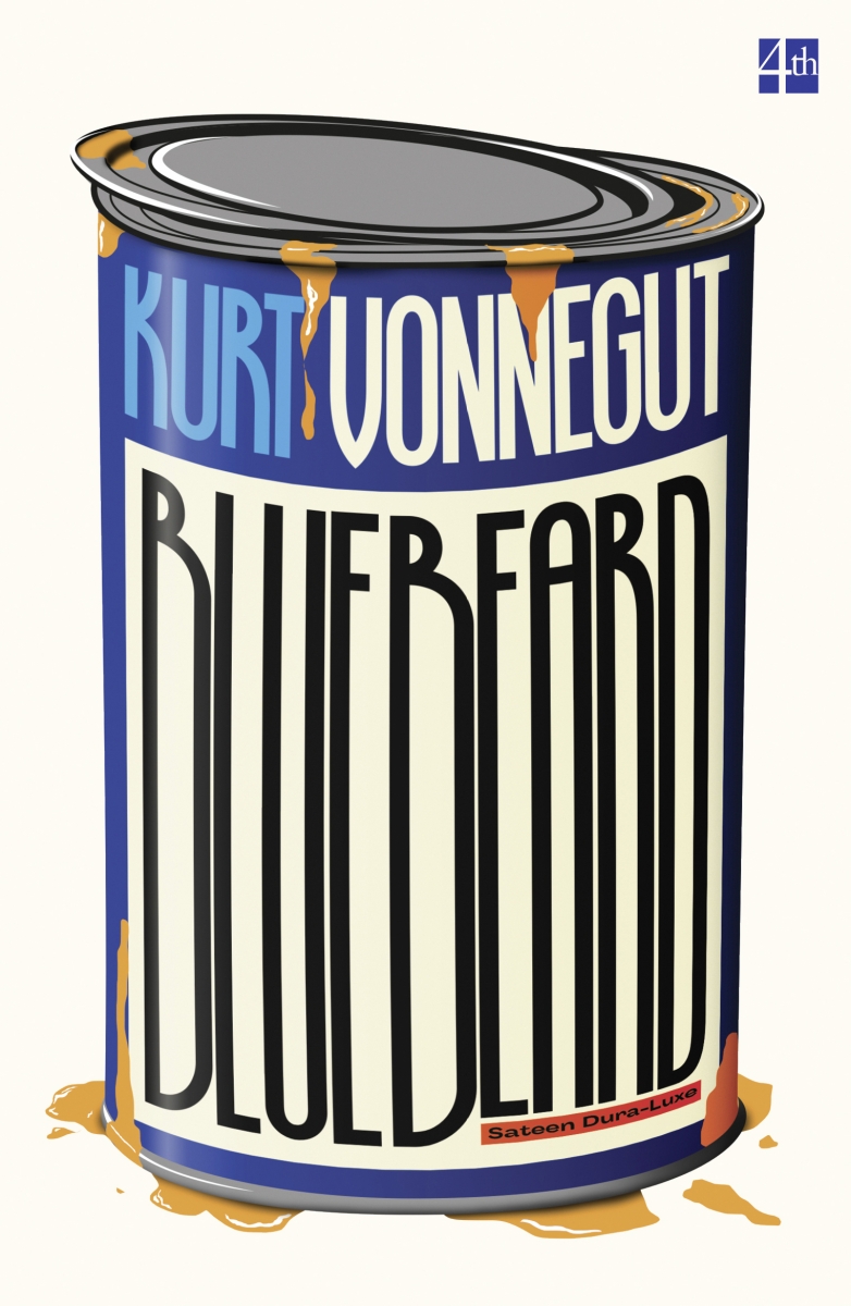
For Bluebeard, I was having a conversation with editorial director Essie Cousins about the HarperCollins backlist when she mentioned that they had three books by Kurt Vonnegut that they need to rejacket. Like many people of a certain disposition, I’m slightly obsessed with Vonnegut, and had been working on a personal project to redo all his covers myself. I told Essie about the project, and this became the start of the new Vonnegut covers I did for 4th Estate.
How did you go about creating the cover?
I spent way too long working on Doxology. I made collages, fake posters; I made the type out of safety pins—lots of different directions. Most of the visuals I made were fine, but not great. I realised that the only thing I liked about a lot of the visuals was how Nell’s name and the title looked in this particular font. There was a lovely balance to it, but it also had a bold, blunt quality. I simply printed the type out at a size that was a little too big for the cover, cut the letters up, stuck them on black paper, scanned them in and that was it. It felt right, and was miles away from everything I’d been doing up until that point. I firmly believe that the process that led to that point was very important though, as all the other dead-end routes led me to this very simple outcome. I would never have got there without all the other, failed approaches.
Bluebeard was a different approach. I was developing a series style for Vonnegut’s backlist and kind of designing them all at the same time, if that makes sense. The 3D, colourful style evolved out of this, and I think that Bluebeard is the best-realised one of the lot. Its probably a bad way to go about designing a set of covers, but it worked well enough in this instance.
Can you share any alternatives or ‘killed covers’ for the project?
Unfortunately I have none for either! It’s the horrible thing about leaving jobs; that you lose all that stuff. And I basically did one visual for Bluebeard...
What has been your favourite project to work on in the past year?
I was lucky enough to work on The Age of Skin by Dubravka Ugresic at the beginning of the year for Open Letter Books. Her writing is incredibly arresting and I really enjoyed the process working on the cover, which was made by hand, and is really simple.

Which book would you most like to design a cover for?
I would have said Kurt Vonnegut, but I’ve been very fortunate in that respect! I’d love to do some of the Irish greats, like James Joyce and Flann O’Brien, but I won’t hold my breath—there’s no shortage of people who’d like to design them.
If you could change one thing about your job, what would it be?
I think it’s time that we as an industry re-examine our dependence on the cover meeting as a method of cover approval and development. It’s often a perfect example of too many chefs in the kitchen and design by committee. So many incredible covers never see the light of day because they don’t survive the gauntlet of the covers meeting, which often needs a unanimous vote of approval. If everyone likes something, it’s usually quite boring, but the meeting allows little room for different opinions or reactions to covers.
To see more of Jack's work, visit his online portfolio or follow him on Instagram.
