You are viewing your 1 free article this month. Login to read more articles.
ABCD 2020: Jonny Pelham on designing Faber Series
The seventh annual Academy of British Cover Design awards, known as the ABCDs, is this year being announced virtually, in lieu of hosting a physical event. Two winners are announced each day this week (commencing 19th October) by the organisation’s Twitter account and Instagram feed.
The seventh annual Academy of British Cover Design awards, known as the ABCDs, is this year being announced virtually, in lieu of hosting a physical event. Two winners are announced each day this week (commencing 19th October) by the organisation’s Twitter account and Instagram feed.
The awards recognise excellence in UK-based cover designers; the criteria for this year’s awards was any book published between 1st January and 31st December 2019 (e-books are admissible). In order to promote inclusion and a breadth of entries, entry is free for designers, who may submit their own work or that of a fellow designer.
Awards will be given in ten categories this week—Children’s 0-5, Children’s 6-12, Young Adult, SciFi/Fantasy, Mass Market, Literary Fiction, Crime/Thriller, Non-fiction, Series Design and Classic/Reissue—with the initial entries whittled down to a shortlist by a number of book- and design-industry insiders.
The winner of this year's Series Design award has been revealed as Jonny Pelham. The Bookseller caught up with Jonny to find out how he came up with the winning design...
First off, can you tell us a little about yourself, and how you landed in the world of book design?
In the late 1990s my dad, who is also a graphic designer, bought a chunky beige Power Mac that he had no idea how to use. I spent a lot of my teenage years setting type for him and tracing his hand-drawn artwork in Macromedia Freehand. I was also coding stupid websites and messing around with a copy of Strata 3D that came free with MacFormat magazine. The summer before I went to university was spent laying-out absurdly hectic catalogue spreads in Quark for Richer Sounds. Also around this time I was very much into The Designer’s Republic and the work they were making for Warp Records. So this was my induction into the world of graphics, I suppose.
In 2006 I graduated with a degree in American Literature and Creative Writing. I had absolutely no idea what I was supposed to be doing with this qualification, or my life more generally. After several months of job searching and inactivity, my mum told me that the company she worked at, Pan Macmillan, needed a short-term, freelance artworker to come in-house for a couple of weeks to help shift a backlog. I ended up staying six years.
It’s not a story I’m particularly proud of, but it feels worth telling for the sake of honesty. Opportunity is wildly unjust and it would be rude not to acknowledge how lucky I was.
After my time at Pan Mac, I spent four years at 4th Estate before joining Faber at the tail end of 2017.
Moving onto the covers, can you tell us a little about the brief you received?
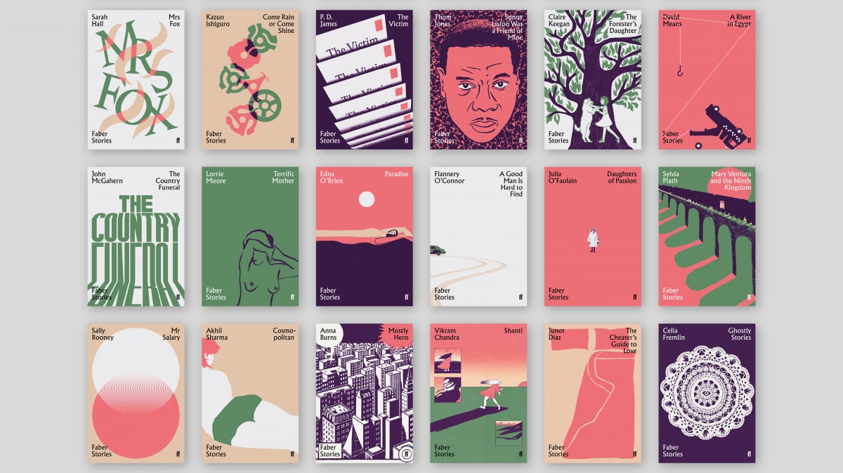
Donna Payne, Faber’s creative director, had another designer working on the Faber 90th Anniversary stories out of house before I was involved. They put together several extremely handsome type-only options, but the editor wanted each of them to feel like an individual book in its own right. Donna and I decided to embrace plurality by assigning a different image-maker to each title.
We managed to get quite a lot of past Faber designers to contribute, as well as everyone in-house, of course, and several freelancers well-known to us. But we also broadened the net to people who don’t usually work on books, which was an aspect I was particularly excited by.
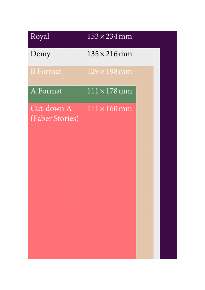
We knew these would be small books, so there wouldn’t be a lot of cover area to play with. This meant borders or frames were out of the question, because we wanted to give as much space to the illustrations as possible. My solution for this was to simply push the type into each of the four corners.
Since there would be so many different styles of illustration, Donna suggested we develop a strict colour palette. Sometimes this threw up problems, but I got the sense that most of the people who worked with us on this were sort of relieved to have one fewer thing to think about.
In terms of reference points, you obviously can’t help but be inspired by the many small-format series Penguin has produced in the past few decades. But for our set we wanted to get a sense of mid-century modern in there, to pay homage to Faber’s early years. And while the palette drew heavily from this era, I was keen to incorporate a surprising and more contemporary element—hot coral red, in this case—to root it to the present.

How did you go about creating the covers?
All of the copy was set in Albertus and Pegasus, as a nod to Faber’s own legendary designer, Berthold Wolpe. These typefaces also have the advantage of being incredibly robust, and they work well both as headlines and body copy.
The overall series design came together in two distinct stages, and there was lots of development in each stage, and small changes kept being made right up to the point of copyediting.
We were also keen to make use of the Wolpe-inspired ribbon device used in the Faber 90 logo, so you can see it being put to work on the spines, back covers and back flaps.
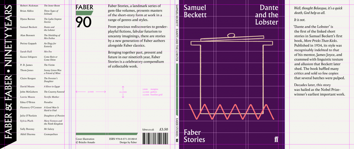
Each individual cover had its own vetting process. Some of them sailed through after only one visual, but others required a lot of back and forth. I feel like I should add a special note of gratitude to Jamie Keenan here, who did the Robert Aickman cover. We really put him through the wringer with this one.
Can you share any alternatives or ‘killed covers’ for the project?
I wouldn’t feel comfortable sharing killed covers from other designers without their say-so. But Charlotte Ager was kind enough to give us permission to show a part of her process for another publication, so I’ve included that here.

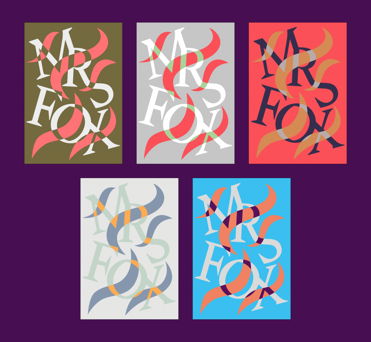
The cover for Sarah Hall’s story Mrs Fox was something I put together, so I could easily try different colour palettes. The design ended up going through as-was, but you can see some of the many different combinations we tried here.
What has been your favourite project to work on in the past year?
It’s difficult to give a single answer, but the covers I did for Jean Genet’s backlist are probably the thing I’m most proud of. It feels like a rare honour to even be vaguely connected to his work, and I feel like I did his work justice. Hanif Kureishi’s What Happened? was also incredibly fun. I spent ages messing about with pixel-sorting algorithms, colour channels and masks. It felt more like play than work.
Which book would you most like to design a cover for?
Early on in my career I was reading lots of critiques of work and work culture: Paul Lafargue, Jonathan Crary, David Graeber, bits by various adherents of the Italian Operaismo movement, Deleuze’s postscript for Foucault’s Societies of Control, among others. I found myself wishing this stuff was better known, easily accessible, low cost, well typeset with glossaries and endnotes, and made using the most basic and sustainable of materials. Rough but attractive. I suppose something in the vein of the Penguin Great Ideas series, but filtered through the design philosophy of Enzo Mari. In the mid 2010s, these sorts of ideas seemed to gain a bit more traction, so perhaps the series I imagined is less urgent now. But I still think cheaply made, well-designed books that seek to create or widen readerships is something I’d like to be involved with, rather than the usual thing of pandering to the expectations of an already existing market.
An alternative, and more direct answer, would be Ursula Le Guin. She is painfully overdue some good-looking paperback covers. I’m very fond of the 1970s Panther editions, but almost all the other covers for her work, at least those that I have seen, are utterly dire. Being asked to re-cover the Hainish Cycle novels, at my leisure and being given the time to engage fully with the text of each, would be amazing.
If you could change one thing about your job, what would it be?
[For the trade to] publish fewer books. There are too many books. I can’t read them all. And I’m annoyed at having to know about things I have no intention of reading. Actually, this applies to most things. Film, music, furniture, clothing. If we could orchestrate a worldwide production strike and redistribution programme for 2021, that would make me very happy indeed. Sorry, this probably wasn’t the kind of answer you were hoping for...
To see more of Jonny's work, visit his online portfolio. The series was art-directed by Donna Payne.
