


You are viewing your 1 free article this month. Login to read more articles.
ABCD 2020: kid-ethic on designing Kill
The seventh annual Academy of British Cover Design awards, known as the ABCDs, is this year being announced virtually, in lieu of hosting a physical event. Two winners are announced each day this week (commencing 19th October) by the organisation’s Twitter account and Instagram feed.
The seventh annual Academy of British Cover Design awards, known as the ABCDs, is this year being announced virtually, in lieu of hosting a physical event. Two winners are announced each day this week (commencing 19th October) by the organisation’s Twitter account and Instagram feed.
The awards recognise excellence in UK-based cover designers; the criteria for this year’s awards was any book published between 1st January and 31st December 2019 (e-books are admissible). In order to promote inclusion and a breadth of entries, entry is free for designers, who may submit their own work or that of a fellow designer.
Awards will be given in ten categories this week—Children’s 0-5, Children’s 6-12, Young Adult, SciFi/Fantasy, Mass Market, Literary Fiction, Crime/Thriller, Non-fiction, Series Design and Classic/Reissue—with the initial entries whittled down to a shortlist by a number of book- and design-industry insiders.
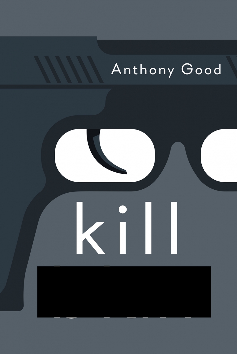
The winner of this year's Crime/Thriller award has been revealed as Mark Swan. The Bookseller caught up with Mark to find out how he came up with the winning design...
First off, can you tell us a little about yourself, and how you landed in the world of book design?
My name is Mark Swan, a.k.a. kid-ethic, the name I've been working under for about 11 years. My career stated as an illustrator for magazines and newspapers. From there, I got a commission from the BFI to do a book cover on Alfred Hitchcock. At this point I’d never really considered designing book covers, but the eureka moment hit and that was that, really. I felt that publishing was an industry that enabled me to explore many different styles and genres, and not get pinned down to one style. I was very lucky to meet many amazing people in the industry who have faith put in me and my designs. From there, I moved into film poster design for a few years. Ninety per cent of my career has been distilling stories into one image, so film poster design seemed a good fit. In the end, my passion was book cover design won out, so I set up kid-ethic in the hope I could make a business out of it—and so far, so good.
Moving onto your winning cover, can you tell us a little about the brief you received?
Richard Evans [the art director] at Atlantic supplied a synopsis as well as the manuscript, plus some initial ideas for direction. The book was described as a "very smart, slightly mad literary thriller", and the book "is meant to be a facsimile of a 'found' diary". Atlantic was keen to use the title as an anchor for the design. Having half the title redacted opened up many possibilities to play with. It was a really exciting brief to get. I did read a fair bit of the book to get a feel of the character and the writing—and also to find out who he wanted to kill!
How did you go about creating the cover?
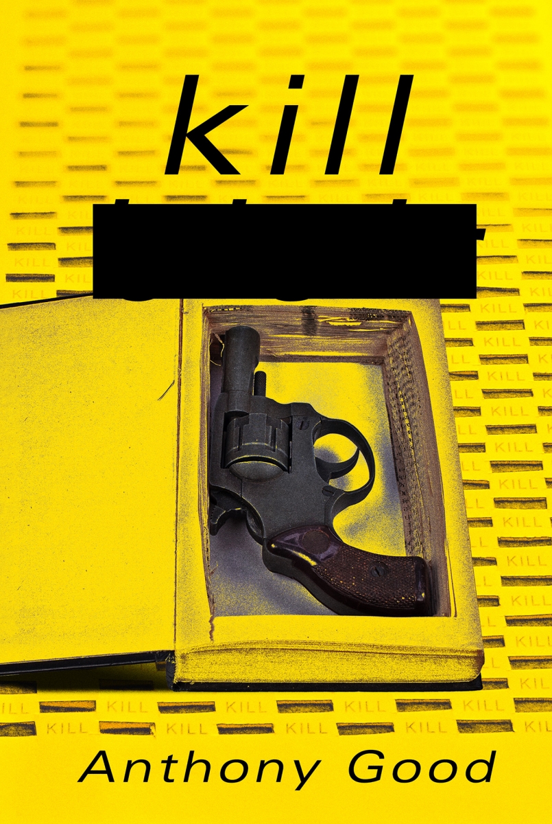
My overall vision for the cover was for it to look very home-made, and using the redacted part as a graphic tool. I played with cutting and printing, repeating words and also simple illustrations. My first round of visuals, though deemed "promising", were rejected as it was felt that my designs suggested an overly-mad central character when in reality, the central protagonist seems quite sane in the book. The design had to be dialled down a bit and the "craziness" needed to be a little more discreet. From here, a more simpler, bolder, more focused approach was needed. For the the cover, I used sticker letters that I brought from a stationery shop—I think they are Arial [typeface]. I wanted the cover to look like it was made by the narrator, so I was keen to use design tools that were easily accessible to a non-designer. I laid out the cover with the redacted name then got a knife and sliced into it. Richard wanted the cover to have "texture and depth", so this process worked well in achieving that. I then photographed it and added some more dynamics in Photoshop.

Can you share any alternatives or ‘killed covers’ for the project?
Luckily there was only two rounds of visuals on this one. I know some went a little too far down the obsessed, crazy route but the others... well they just weren’t right. Richard, the author and the Atlantic team saw something on the paper-cut versions, but it needed to be simpler and more immediate.


What has been your favourite project to work on in the past year?
I’ve been doing work with the BFI designing some of its classics series. I had done some a few years ago, and I thought I had had my time on those, but suddenly this year I got some more. It was really exciting, if not a little scary... that’s when you know you have a great project. That mix of creative excitement and fear of messing it up pushes you to make work you are proud of. You really not allowed to mess up a cover for The Exorcist, are you? I’ve been very lucky this year, especially given the situation the world is in, by having lots of fantastic projects and clients.
Which book would you most like to design a cover for?
I’m a sucker for horror, so I’d love to have a go at Adam Nevill's books.
If you could change one thing about your job, what would it be?
There has been a lot on social media about designers not getting credit where it’s due, especially when it comes to cover reveals. It would be like announcing a new book on Twitter and not saying who wrote it. In all though, I love working in publishing and with the people in it.
The book cover was art directed by Richard Evans for Atlantic Books. To see more of kid-ethic's work, visit his online portfolio.


