


You are viewing your 1 free article this month. Login to read more articles.
ABCD 2020: Thereza Rowe on designing We All Have Feelings
The seventh annual Academy of British Cover Design awards, known as the ABCDs, is this year being announced virtually, in lieu of hosting a physical event.
The seventh annual Academy of British Cover Design awards, known as the ABCDs, is this year being announced virtually, in lieu of hosting a physical event. Two winners are announced each day this week (commencing 19th October) by the organisation’s Twitter account and Instagram feed.
The awards recognise excellence in UK-based cover designers; the criteria for this year’s awards was any book published between 1st January and 31st December 2019 (e-books are admissible). In order to promote inclusion and a breadth of entries, entry is free for designers, who may submit their own work or that of a fellow designer.
Awards will be given in ten categories this week—Children’s 0-5, Children’s 6-12, Young Adult, SciFi/Fantasy, Mass Market, Literary Fiction, Crime/Thriller, Non-fiction, Series Design and Classic/Reissue—with the initial entries whittled down to a shortlist by a number of book- and design-industry insiders.
The winner of this year's Children's 0–5 award has been revealed as Thereza Rowe. The Bookseller caught up with Thereza to find out how she came up with the winning design...

Pictured: Thereza Rowe (left) with Owl & Dog founders Yeonju Yang and Claudio Ripol
First off Thereza, can you tell us a little about yourself, and how you landed in the world of book design?
I’m a London-based illustrator and author and I work from my little studio/den in the garden. I am also a self-confessed silkscreen-printing demonette. It’s my biggest obsession when it comes to image-making. The possibilities it provides get my head bubbling with liquid fizzy happiness.
I live with my husband and our two rescued cats, Mr Pip and Olly. They are the best cats ever. I speak to them in four languages and they inspire me loads throughout my projects. OK, now you can tell I am a mad cat lady...
Moving onto your winning cover, can you tell us a little about the brief you received?
My publisher (Owl & Dog) and I actually had a pretty clear idea of what we wanted for the book format and cover from the start. I remember meeting up with them for the first time and Yeonju [Yang, co-founder of the list with Claudio Ripol] pointed out a little sketch from one of my sketchbooks that she had spotted on my Instagram feed. We decided we wanted the book to have a face-outline format as to represent the part of our body where we both process and show our feelings.

The book is for very young children and we talked a lot about keeping the format bold and simple, as the subject of feelings should really be the main focus of it. It’s a pretty relevant subject in the current age we live in, and therefore one that should be talked about and explored from an early age.
I was excited from the outset as it was decided that I could have four Pantones (spot colours) to work with. Working with Pantones is the nearest thing to screenprinting, as the printing process works with special inks that don’t mix during printing (each colour prints as a layer), hence one can plan overlays and other techniques which wouldn’t otherwise be possible with CMYK [printing processes]. The colours come out really bright, and it totally translates my silkscreen printing style.
How did you go about creating the cover?
As I mentioned, we took the idea from one of my sketches and I just re-drew and adjusted it to a nice size for tiny hands. We had a few revisions: the first one being the nose to be round, as the book was to have no sharp cuts or edges for both safety reasons, and for making sure the format of the book would be as free as possible from bumps and tears.
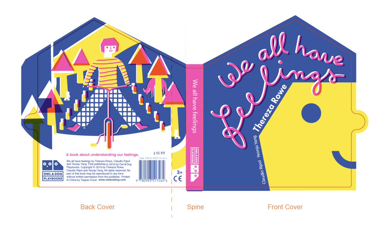
Regarding the lettering for the title, as the format is already bold and graphic, I wanted it to be something that followed the shape of the head—like feeling and thoughts that come in and out of our heads. I did try setting the title with some typefaces, but we felt it needed to be less restrained and more free and fun. So I hand-rendered the title using Posca markers and vectorised it, so that it would make it easy enough to change colours, play with spacing and make whatever further edits were needed.

Can you share any alternatives or ‘killed covers’ for the project?
We didn’t really have "killed covers" as the idea was already quite tight around the face outline. I suppose the ones using typefaces were killed as I didn’t feel they worked well to begin with. So I presented Owl & Dog with a selection of colour variations and the hand-rendered type for the title. From there, I just worked on a few tweaks before achieving the final cover.
What has been your favourite project to work on in the past year?
I’ve had a lot of fun working on my new upcoming book We All Have Imagination, which is actually a sister book to We All Have Feelings, again with Owl & Dog. I really can’t help but love working with these guys! The whole process is always a joyful one for me, as we seem to be mostly on the same page.

We kind of knew from the beginning that We All Have Feelings had a potential to be developed into a little series which explores precious things us human beings all share. So I’m pleased to announce We All Have Imagination is out this month!
This year I’ve also very much enjoyed painting a massive bear (sculpture) for The Children’s Hospital Charity Bear Trail, which consists of 60 bears painted by different artists to be dotted around the city of Sheffield. It was really awesome to work on such scale—the bear is two metres-plus tall. That was the highlight of working during lockdown for me.
To see more of Thereza's work, visit her online portfolio or follow her on Instagram.


