You are viewing your 1 free article this month. Login to read more articles.
As the Crow flies: Faber designer’s tour of London retailers hits the shelves
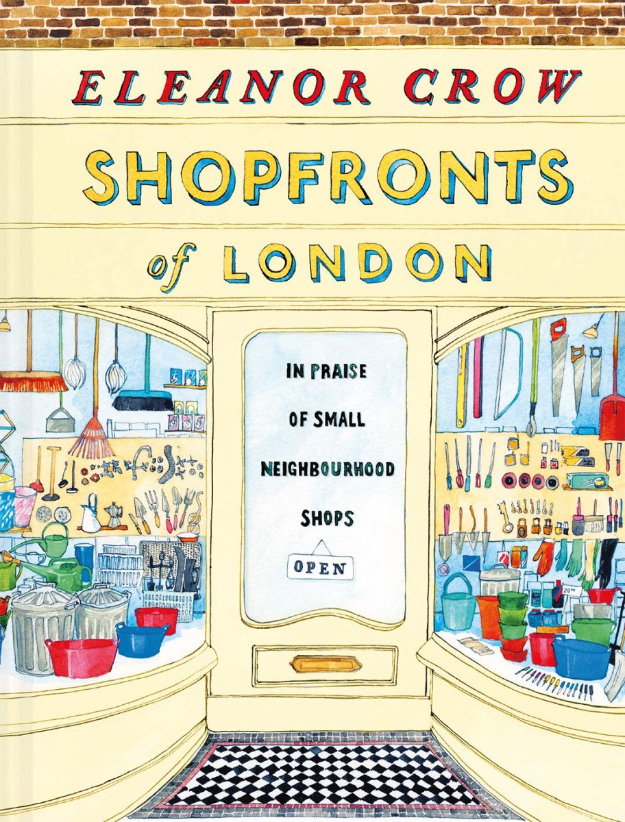
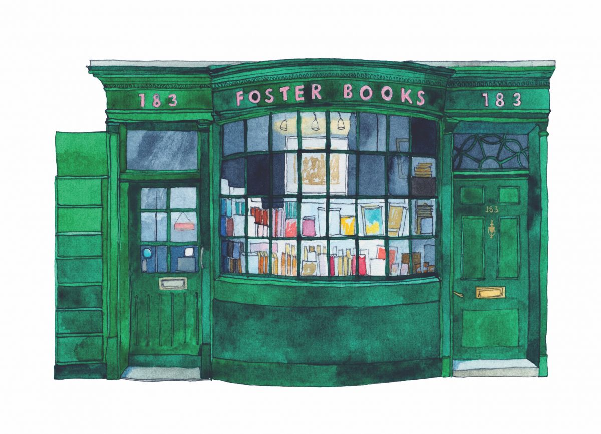
A celebration of the high street arrives this month in the form of Eleanor Crow’s Shopfronts of London, published by Batsford in conjunction with Spitalfields Life Books (£14.99, 9781849945622). It is a hardcover collection of Crow’s watercolour paintings of retailers on London’s streets, each artwork accompanied by a brief description of how the artist discovered the shop and, where appropriate, details of the retailer’s history. Pleasingly, two bookshops make the cut: John Sandoe Books of Chelsea, and Foster Books in Chiswick.
Batsford says the book is a title to “cherish the independent shops and family businesses that enrich the city with their characterful frontages and distinctive typography”, and it’s a charming paean to inventiveness at a pivotal time for the British high street, with business rates and the sprawl of mega-brands leading to an increasingly monotonous, formulaic line-up of outlets in most UK towns and shopping streets. The book contains more than 100 portraits and Crow, who may be familiar to many in the trade for her cover design work for Faber & Faber, says it came about a little fortuitously. “Spitalfields Life [blog] ran a story about Arthur’s Café on Kingsland Road, and I sent a watercolour I had painted of this wonderful place as part of a series I was doing of cafés. I was asked to produce more, and I sent over 21, doing 17 of them in three weeks.” She had been “scribbling notes about each shop as I went along” painting them, and hails the work of a “brilliant researcher” who helped her with the text sections.
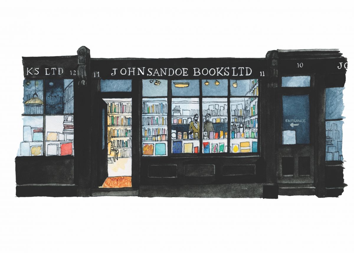
Crow says she has been creating the paintings for “about 10 years, interspersed with other design and illustration work”. To make them, she says, “I use a tiny block of hot-pressed watercolour paper, small brushes, and a small tin of Winsor & Newton watercolours that I can hold with my thumb. People imagine the works to be large, and then are always surprised how small they are. But the smallest lettering, I always do back at the studio. There is only one chance to get it right,” she adds—because the original watercolours are sold. (Crow’s paintings are also to be exhibited from next month at the Townhouse Gallery in London’s Spitalfields.)
It’s little wonder that an artist would be drawn to such outlets: most are decades old, with signage and lettering that would have been bespoke, giving each a unique “brand”, of sorts, in an era where the concept of “branding” would have been alien to many—hence their charm. And, interestingly, a number of lettering artists and sign-painters are seeing business swell, as retailers seek to appear authentic, individual and independent to set them apart from the competition. Archie Proudfoot and Better Letters are two such firms whose work may ring a bell.
Reading the signs
 “People admire the skill and talent of sign-painters, and [such a fascia] becomes a talking point for the shop and customers,” Crow says, adding that an enduring and successful shop signage is “about expertise in typography and lettering, whatever the materials”, and noting that “some shops are even unearthing old signs below the plastic, and using them. The names are often old-fashioned and evocative, so people like to keep them, even when it isn’t the name of the current business.”
When it is suggested that striking a balance of lettering, branding and textures isn’t a far cry from the demands on a book cover designer, Crow concurs, stating that “there’s an appetite for innovative covers” currently, and that “most designers have a whole host of visual influences and references, like an internal library”. So the lettering of, say, Walthamstow fishmonger Davies & Sons could have fed into her work on the cover of Francis Spufford’s Golden Hill, which she cites as one of her favourite recent creations—she also says that, for the female figure on the left of the cover of Spufford’s novel, she had to rope in a Faber colleague to act as a model—alongside Max Porter’s Grief is the Thing with Feathers. Perhaps the closest relation to Shopfronts... in her books portfolio, however, is her watercolour illustration of different pebbles which wraps around Clarence Ellis’ recent hit The Pebbles on the Beach.
Crow did not design her own book, however. That task fell to Friederike Huber, who has designed a number of elegant, understated publications for Spitalfields Life Books and Hoxton Mini Press, among others. This is one such edition: the paintings occupy enough space that the shops’ finer details can be made out; captions are set in a delicate italic with characterful swashes on many capital letters; and body copy is set in Garamond in a spare, roomy two-column grid (the introduction’s longer length calls for a single column). Crow is “very happy with the design”, adding that Huber “tried out a number of layout solutions before this final one, which allows for a varied page with the perfect amount of space for text and image”.
And the cover? “Apart from redrawing the lettering, the cover went straight through with no changes,” Crow says—a near-unheard-of relief for a cover designer, presumably. “I did a lot of pencil sketches first, to make sure the shapes worked well with the format of the book,” she adds, noting that the one illustrated on the front is “the only invented shop in the book”.
So which is her favourite? “I think everyone’s favourite is Pellicci’s,” she replies, referring to a Grade II-listed Art Deco café on Bethnal Green Road in east London, an East End institution standing since 1900. Crow is also “fond of the Tea Rooms at Holborn, because it was the first one I painted. But really I like all of the shops. That’s what made me paint them—because they looked so good in real life.”
Eleanor Crow’s Shopfronts of London: In Praise of Small Neighbourhood Shops is published by Batsford in conjunction with Spitalfields Life Books, priced at £14.99. An exhibition of Crow’s watercolour paintings of the retailers will open at Townhouse Gallery next month.
