You are viewing your 1 free article this month. Login to read more articles.
And Other Stories unveils new sustainable design for future titles
And Other Stories has unveiled a new “ecologically sustainable” design for its books, after “close consultation with authors, booksellers and shareholders, and a year-long development period involving four world-class designers”.
The Sheffield-based indie publisher said that, in line with its “ international, ecological publishing from outside the metropolitan centre”, the team chose ecological suppliers, including North of England partners, as well as a Brazilian designer.
The publisher says: “And Other Stories’ design brief and concept was simple: it’s the words that matter. Our authors are extraordinary. Their words are all we need to invite readers into the text.”
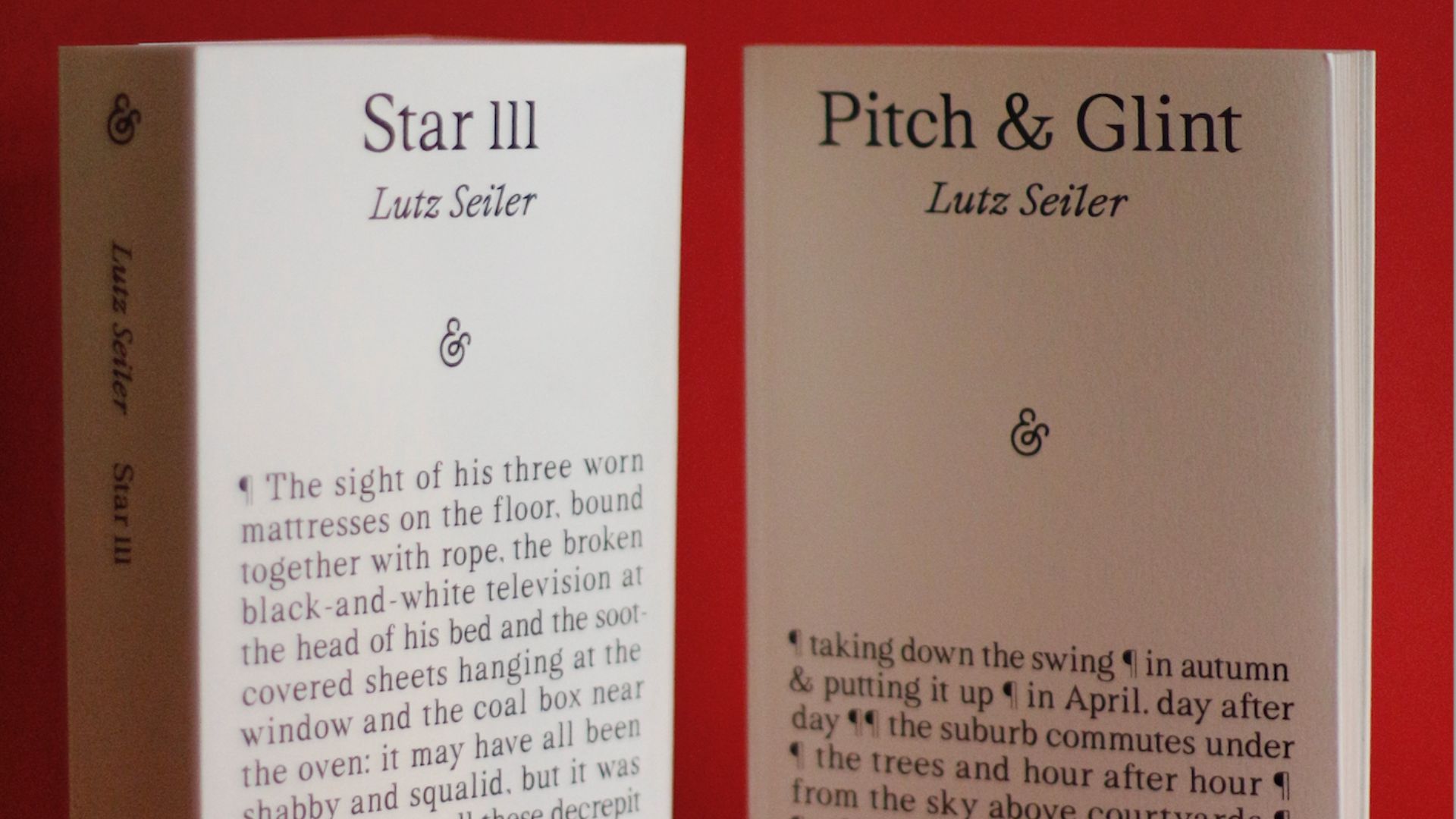
After a competitive design process, the publisher chose the proposal by Brazilian designer Elisa von Randow, from Alles Blau studio. The chosen font is Stellage, a display typeface released in 2020 by SM Foundry, a digital type foundry based in The Netherlands.
“Full of personality – surprising touches such as the arrowing comma and angular brackets – and impeccably designed, it conveys quality and a modern, contemporary voice,” the publisher says.
Moreover, the publisher’s logo has also been updated, removing the diamond around the ampersand and using the Stellage font. Inside pages will continue to be set in Albertan Pro and Linotype Syntax. The series will be launched with a campaign using the hashtags #judgeabookbyitscover and #puttingwordsfirst.
Designer Elisa von Randow said: “It’s always a challenge to develop a book cover design, even more so when the design has to last for a long time and relate to different types of authors and narrative styles. Choosing simplicity and bringing the text to the cover was the starting point suggested by the editors. The next step was to choose a typeface that would be efficient to print, but would also convey the contemporary and bold spirit of the publisher’s catalogue. After many studies, the simplest and most radical idea was finally chosen.”
Publisher Stefan Tobler commented: “I can’t help thinking of Derek Walcott’s beautiful poem that says ‘The time will come / when, with elation, / you will greet yourself arriving / at your own door’. After 12 years of publishing, it feels like And Other Stories’ design has come home. Elisa’s design captures our press’ spirit: there’s room for play and humour. It’s thought-provoking in style and content. It’s contemporary and a look that will last.
There’s also something right about our series starting in September with two books by Lutz Seiler. His poetry collection Pitch & Glint first appeared in 2000 in Suhrkamp’s iconic Willy Fleckhaus-designed series, a series that launched in 1963 and has long been an inspiration. As a nod to that series, in each book we will we have a full-page photo of the author on the final page. Seiler himself is a writer who started work as a tradesman and has a strong love of craft and manual making, and we are looking forward to sending him these well-made objects."
The cover stock paper is Colorplan card, as developed by Hull’s G F Smith. It is made sustainably with FSC-certified paper at the James Cropper mill in the Lake District. And the cover and spine sport black biodegradable foil.
The publisher has also opted for a new FSC paper for inside pages with low carbon emissions and chosen Clays as the printer. “Clays has a clear focus on constantly improving the sustainability of its operations. It is the first UK printer to sign up to the Science Based Targets initiative (SBTi), to which it recently submitted its emission reduction targets for approval,” the publisher said.
