You are viewing your 1 free article this month. Login to read more articles.
Ebury Publishing unveils new 'non-corporate' logo
Ebury Publishing is launching a new "non-corporate" logo for its list in July.
Publisher and deputy m.d. Jake Lingwood said as Penguin Random House's (PRH) non-fiction specialist and a B2B brand, it was important that Ebury Publishing stay "relevant, exciting and accessible" and to have a logo that conveys those qualities. He added that "first and foremost as a creative publishing house" it was important that the logo didn't "look corporate".
The new image makes use of a new standalone 'E', in a "fresh and vibrant" teal blue. Designed to work in harmony with the PRH parent brand, the capital letter is shadowed in PRH orange and takes up a similar amount of space as its parent's logo. It has been developed using an "imperfect" overprint effect which Ebury says it has deliberately embraced "in the spirit of creativity – the essential quality of a 21st Century publishing house," said Lingwood.
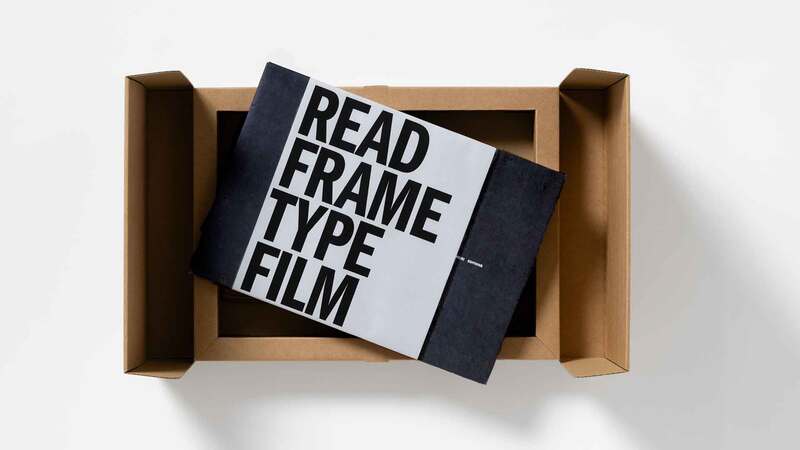
Ebury worked with design and branding studio Form to produce the logo. Form was co-founded by Paula West and Paula Benson, who also worked on the rebranding of Abbey Road Studios and V Festival.
Form's approach to the Ebury Publishing logo was "to reflect the creativity at the heart of the brand". It characterised the capital E as "tall" and "confident", adding "it takes its cues from modern craft and maker cultures and lifestyles which in turn take their cues from traditional practises".
Lingwood commented: "As the number one non-fiction publisher in the UK it’s important we stay relevant, exciting and accessible. Ebury Publishing is a B2B brand and we wanted a logo that gave agents, authors and booksellers a feel for the qualities that make us a stand-out company; we are Creative, Commercial and great people to work with. We wanted something that reflected that but that doesn’t look ‘corporate’. We are first and foremost a creative publishing house."
