You are viewing your 1 free article this month. Login to read more articles.
New HarperCollins font aims to improve readability and further sustainability goals
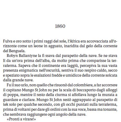
HarperCollins has announced it has created a new font for non-English books published in Europe and South America. HC Arc® is designed to improve the reading experience and further the organisation’s sustainability goals.
The publisher says the font has “a dynamic sense of motion” and, as well as being designed to improve readability, will reduce the amount of paper used per title by up to 20%.
Launching in July, it will be exclusive to HarperCollins and used on select non-English titles published by the company’s European and South American businesses. Chantal Restivo-Alessi, c.e.o of international foreign language and chief digital officer, said: “We are very excited about the introduction of HC Arc®.
“It promises to deliver on two important initiatives at HarperCollins: improving readability and sustainability. Translations in Europe can be extremely lengthy. This new font is a creative way to publish shorter books while accommodating the longer text, all the while ensuring that he reader’s experience is actually improved. It is elegant and dynamic, and we look forward to bringing it to market this year.”
HarperCollins partnered with 2K/DENMARK to develop the proprietary typeface, which has a darker texture, higher x-height, and low contrast aesthetic. It was designed to provide an "elegant representation of the text", and can be used on high-bulk paper. With less paper usage, it helps to reduce the environmental impact of the books.


