You are viewing your 1 free article this month. Login to read more articles.
The Quarto Group rebrands with new logo
The Quarto Group has rebranded with a new logo that is "less corporate and formal".
Although the publisher will still officially be known as The Quarto Group, its logo and branding will be shortened to just Quarto.
The organisation says its rebrand is to “cement its status as a creative illustrated book publisher” and that “the new logo matches the publisher’s modern, forward looking, and dynamic nature". It was developed by the design agency Pentagram.
The publisher said: "Quarto’s bespoke new logotype is underpinned by four circles, neatly echoing the publisher’s name. Set in monochrome, the logo is complemented by a colour palette reflecting the four seasons of the calendar year and the cyclical nature of publishing."
The move comes during a period of change for the company, which recently launched two new imprints: a new gift product imprint, Kaddo, and a new lifestyle imprint, yet to be named.
Kaddo will be led by Laurence King Publishing’s former editorial director Sarah Batten, and the new lifestyle imprint will be led by Octopus’ former publishing director Eleanor Maxfield, who just joined Quarto.
Both imprints will have books and products ready for autumn 2023, bolstering children’s and adults’ publishing output. The group has also moved to a new office on London’s Southbank.
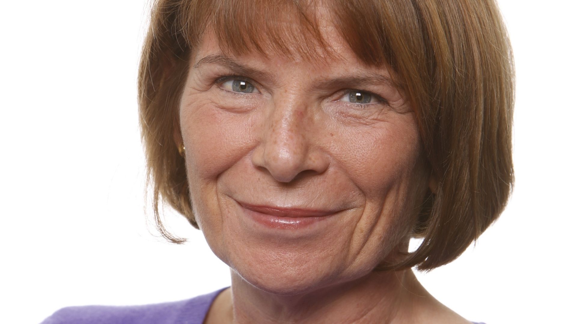
Alison Goff, c.e.o, said: “A year ago when I took the helm of The Quarto Group my vision was to make Quarto synonymous for creative, ambitious and agile publishing. Now with our versatile new visual identity, relocation in the heart of London’s creative centre and the launch of two new trend-leading imprints alongside our thriving exiting imprints in the UK and the US, I am confident that Quarto is ready for the next phase of its evolution. We are all looking forward to working with more authors and illustrators and giving their works the best-in-class publishing journey.”
